Right…I need a powerpoint layout for an interview presentation…googling turns up a bunch of free templates…I just need something simple and clear but as professional/good looking as possible, and I can’t waste much time thinking about it  Any tips?
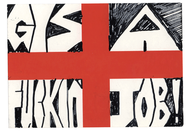
Are knob gags allowed?
Encouraged, I believe.
Less is more imo, stick to a clean and simple appearance and concentrate on the content. If an interview for a large company consider robbing a graphic / logo from their website place that bottom left corner and shove your name top right. That’s what I’ve done in the past and it worked ok for me.
I know an organisation that halted an interview immediately for someone that did that. For misappropriation of their corporate identity. I’d urge caution in the regard.
Fair point, Ive done it twice and got both jobs. (Corilation doesn’t imply causation admittedly)
ahem…correlation
I think some companies have their heads too far up their arses, and care to much about that stuff. Problem is, it is usually too late when you find out who it is

Correlation yes,
If that’s enough to halt an interview id be more than happy to be told to fuck off, would be too much like hard work dealing with jobs worth bull shit like that on a daily basis.
I used the logo of my current employer in my interview presentation, I also nicked their colour pallate.
With PP it is always good to end with a strong summary - This is what people will take away and hopefully action
Palette ![]()
If you took his/her palate the only colour would be red ![]()
As above really. Golden rule is make it easy to read especially if projected.
White or very light coloured background, no small font or tables/ diagrams that are detailed and have font that it is hard to read.
I would use their logo but be careful to retain its integrity and not distort it. If they’re going to be utter cocks about this then I wouldn’t want to work for them anyway.
It was mainly red 
Keeping it simple-White background, black text; Helvetica Bold 44 for headings, 32 point for bullet points (<6 words, <6 per page). Only pages with bullet points are overview and key points at the end. <1 slide per 2 mins. The rest will be flow charts, blue with light text (yellow or white). Page number bottom right. Might add section title, not decided yet- depends how I finalise it all (might have a few more bullet point slides if totally necessary). It’s coming together, albeit slower than I would have liked.
You need to post it here, for notes 


Make all of the text swirl all of the way round
Yep, everyone loves lots of transitions.

